Fitt's Law
United HealthcareI like how this healthcare web page is simple and to the point. They have small areas that give you a quick text based summary and then a button. They also have a simple and generic clip art that is nice. This makes it nice an easy to get to were you want to go quickly. The buttons are colored in blue and very simple and easy to find.

Visual Hierarchy
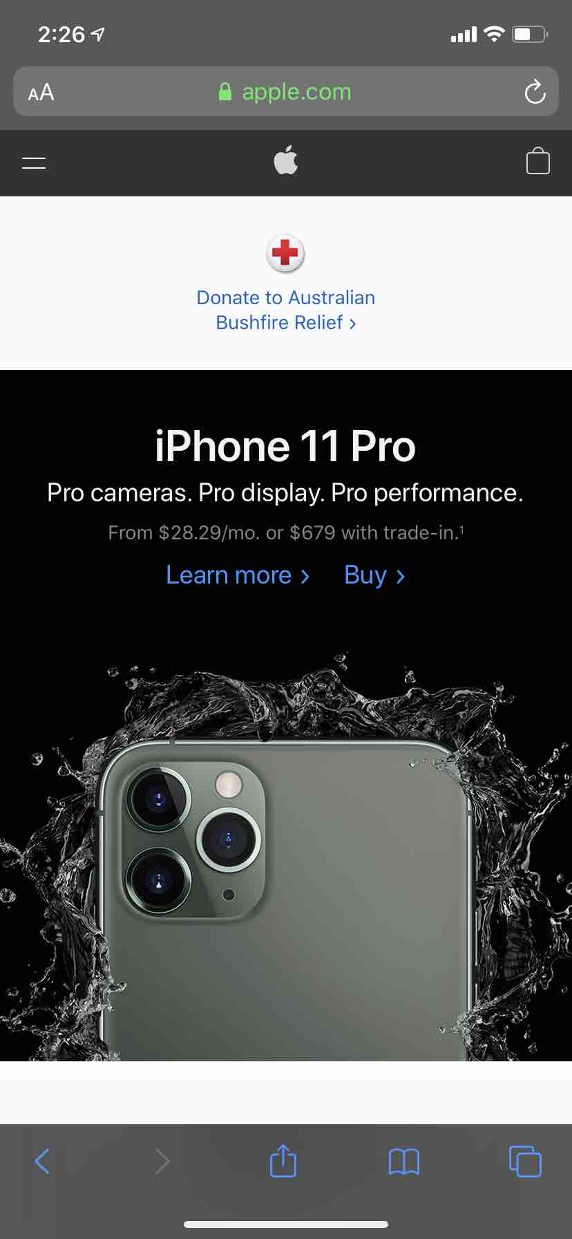
AppleWhen you first got to apple.com you see their producsts. Their producsts speak for themself. They do not have very much wording at all. They simply just have pictures of the producsts, then the name of the product, followed by a smaller "learn more" and "buy". I have always loved the simplity of Apple.com.
Rule of Thirds
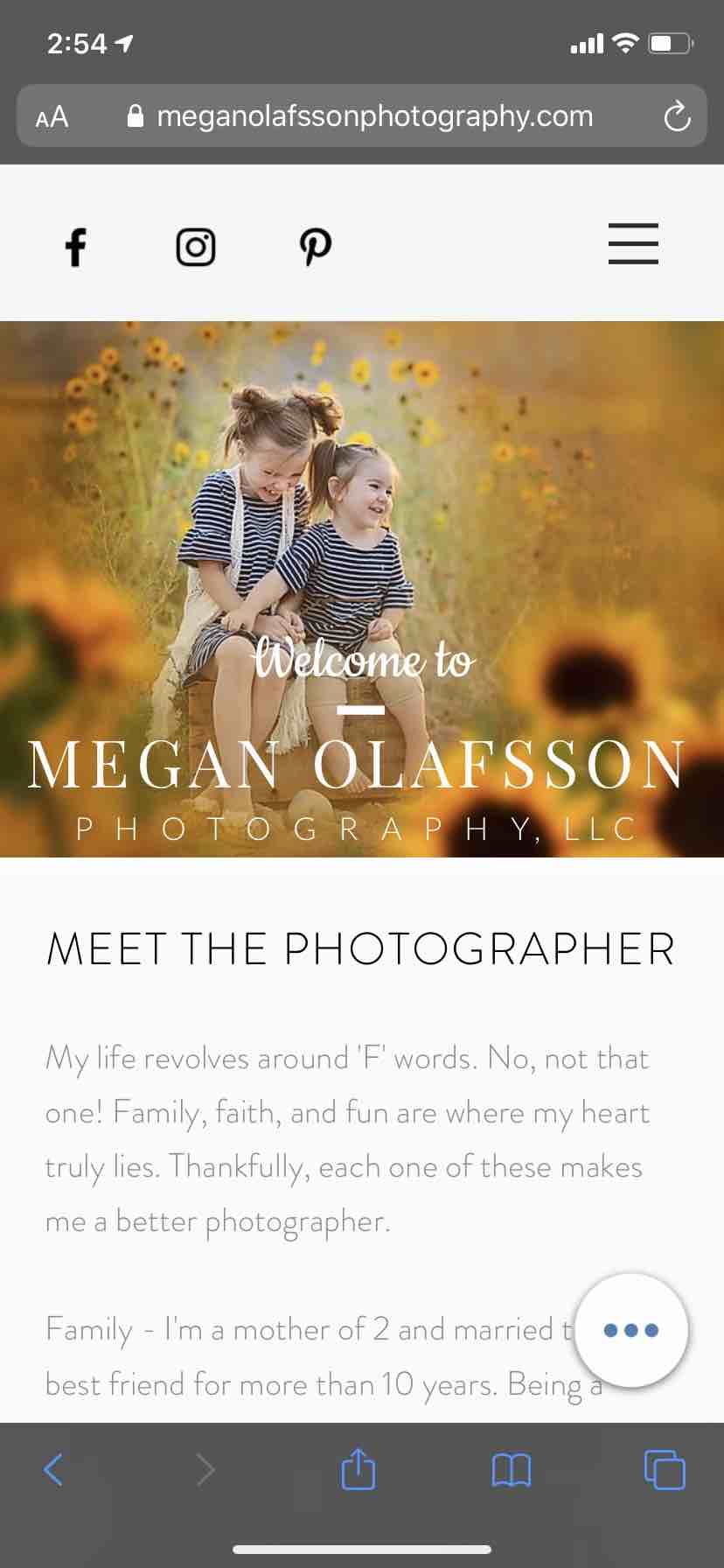
Megan Olafsson PhotographyThis is a photography site. The landing is of two girls that is just a little left justifyed. The social media is also left justified at the top but everything else is centered. I just loved how that picture was the first thing that cathes your eye and is playing by the rule of thirds. Eveyrthing else is also nice and clean.